
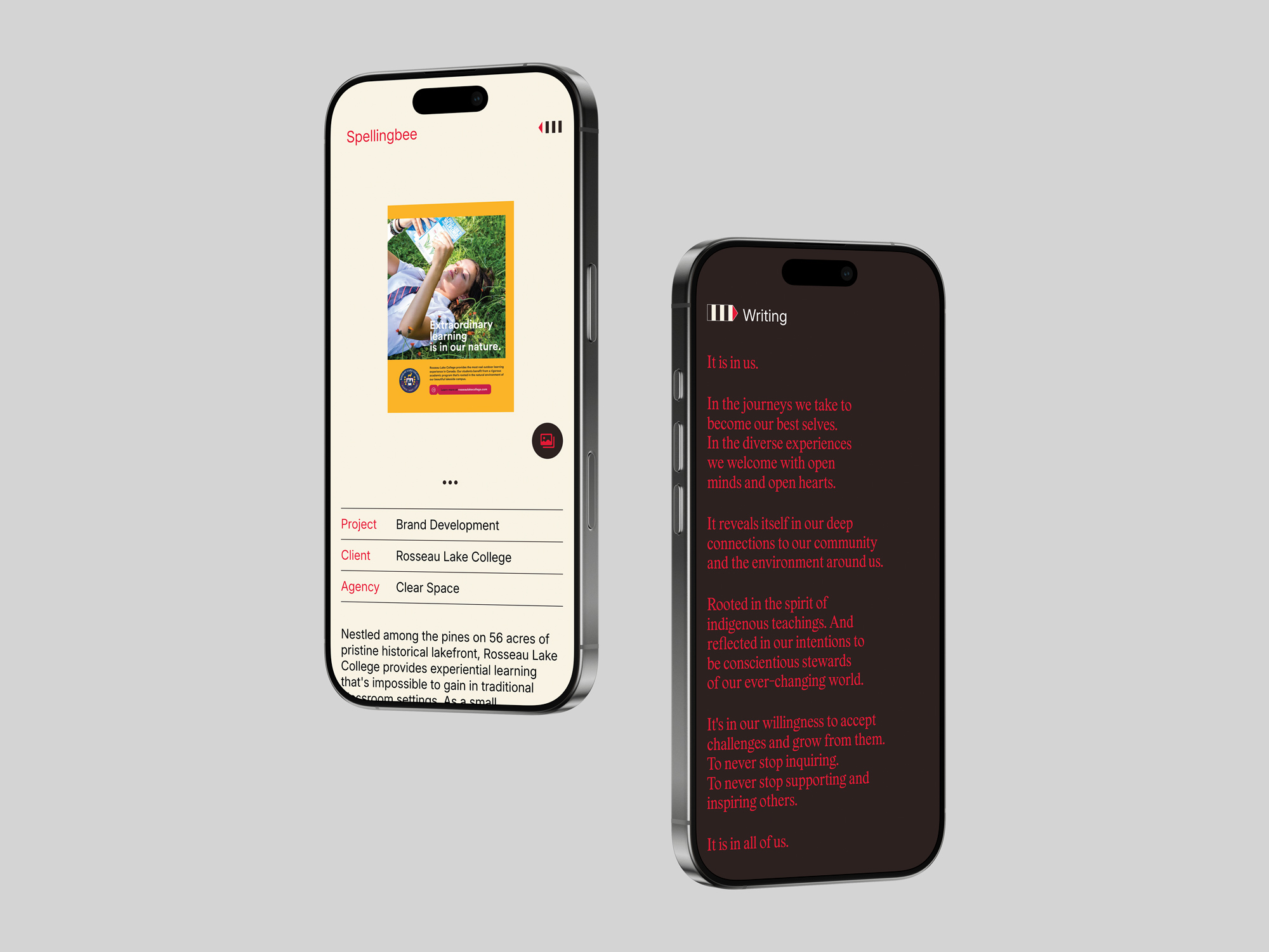
Refined to the point: A new identity and website for Spellingbee
We’re stoked to share the launch of a refreshed identity and website for longtime friend and collaborator Jack Liang and his writing and communications practice, Spellingbee.
Originally last updated in 2016, the refresh reflects how Jack’s practice has evolved—broadening the way his work and services are presented, improving usability, and modernizing the technical foundation under the hood. The goal was simple but ambitious: create a clearer, more comprehensive way to showcase the full scope of his capabilities, from writing and creative development to strategy, while making it easier for agencies and design partners to envision how he can support their work.
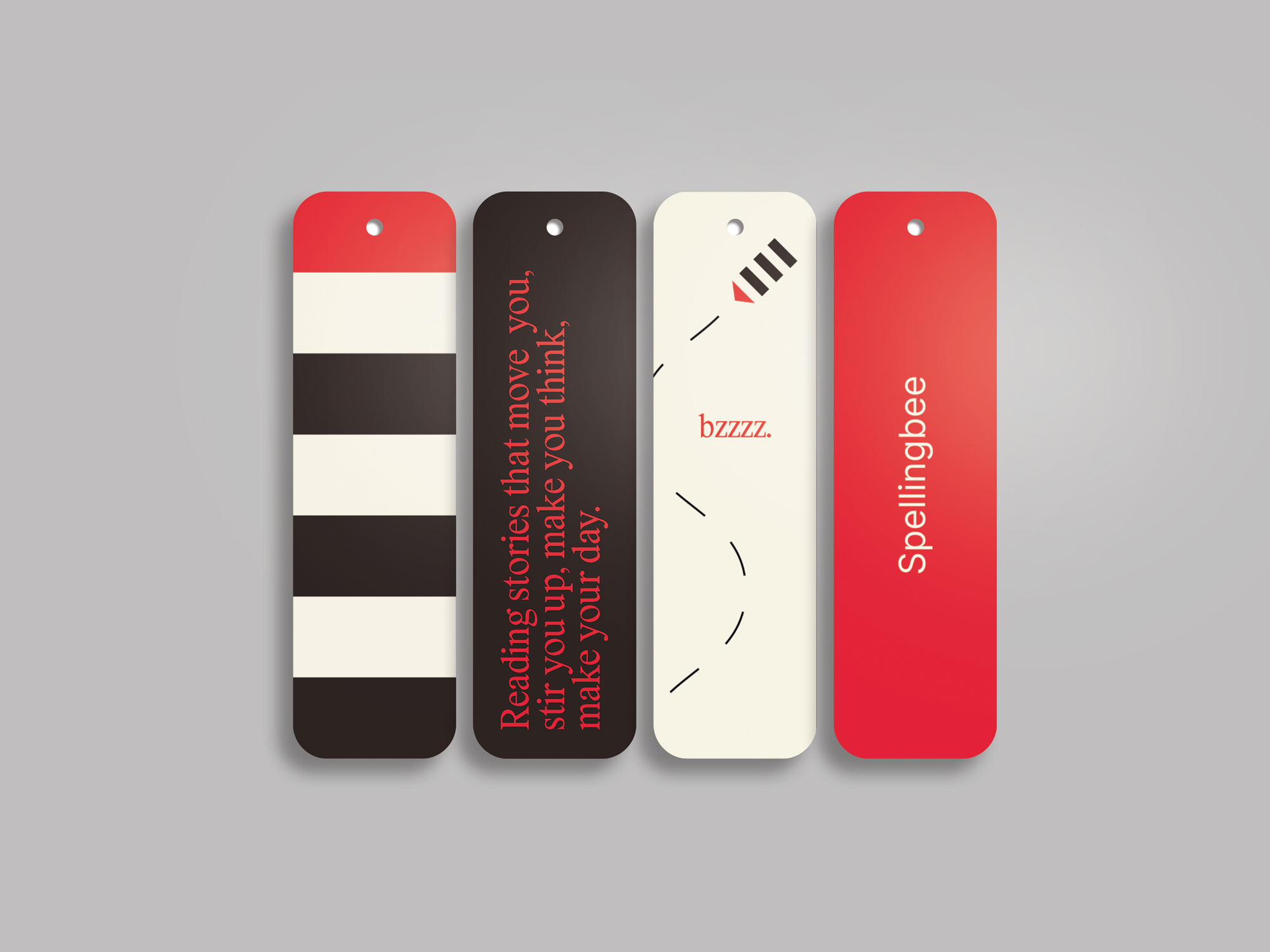
In true Jack form, the new look is minimalist and considered, anchored by elegant typography and a smart, understated interface that puts the thinking first. We also introduced a new visual device we’ve affectionately dubbed the “bee pen.” It’s a familiar, flexible logo bug (pun intended) designed to live comfortably on the web and print—part functional signature, part whimsical nod to the Spellingbee name.
“Working with Clear Space is a true partnership. They’re really good at helping you articulate what you’re trying to achieve while opening your eyes to opportunities you hadn’t even thought of—which ultimately makes your project stronger. Couldn’t be happier with the site. They’ve done a great job of capturing who I am. This is me in web form.”
— Jack Liang

Our relationship with Jack goes back to our early days as young creatives, shaped by a shared belief in defending the why before the what, stripping away empty calories, and pushing for ideas with real weight. This project is a continuation of that same mindset. Clear thinking, thoughtfully expressed.
Visit the new Spellingbee site to see the work in its refreshed form, and read our full interview with Jack for a deeper look at the thinking behind the words.
